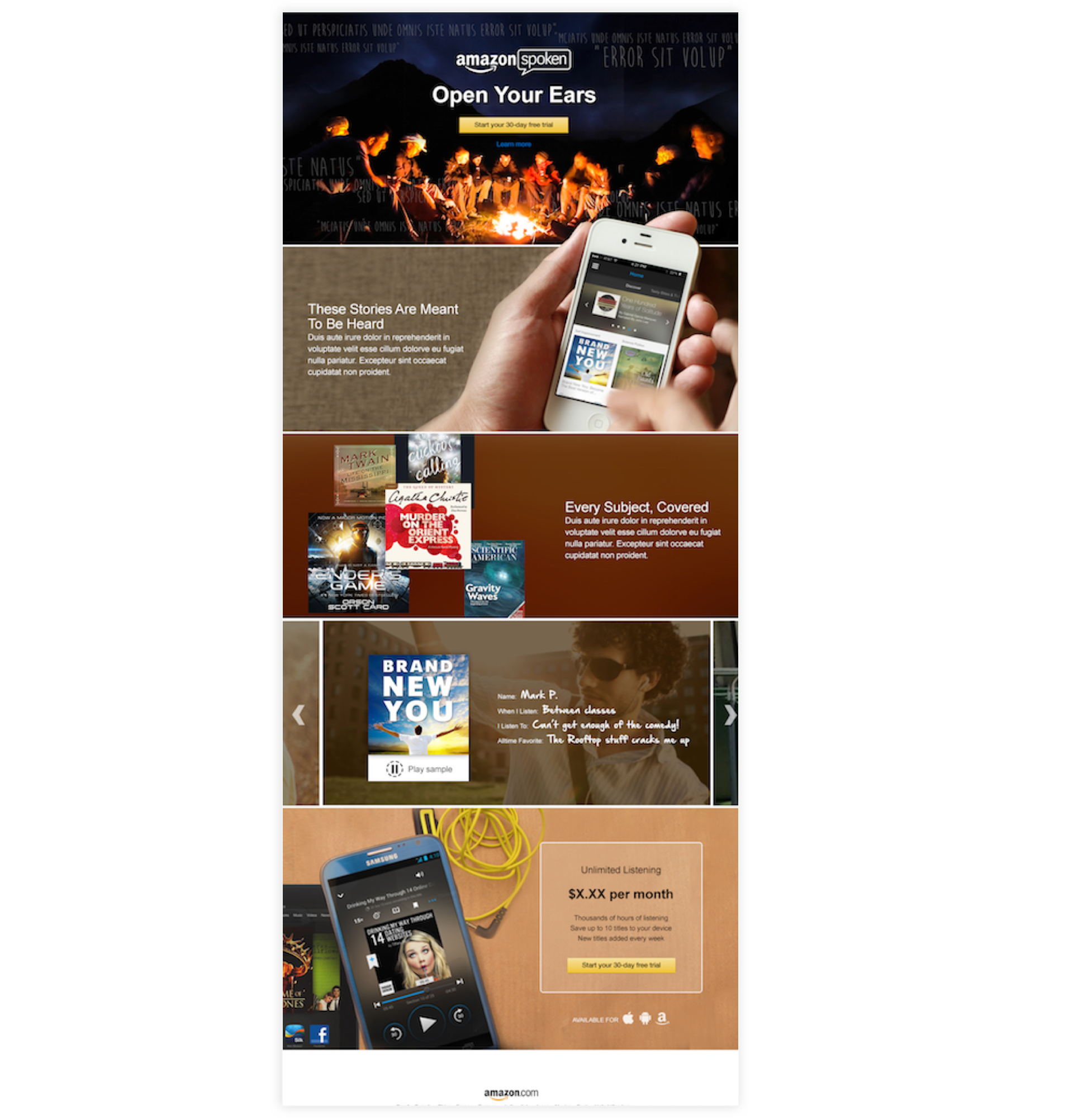
Amazon Audiobook Listing Page and Subscription Dashboard
At Amazon, I helped concept test a new app between Audible and Amazon. We needed to build out a product page for a new mobile app. The mobile app was using Audible’s technology white-labeled for Amazon for a paid monthly subscription.
As the UX lead, I helped create wireframes using Amazon’s pattern library. We wanted to convey a story behind the app and provide an effortless to manage the app’s subscription settings.
After completing a competitive analysis we were able to pinpoint the exact content for the pages and all the varying use cases needed to support our users.

Product Listing Page Design for Amazon.com

Manage Subscription

Subscription downgrade options for increased retention.


