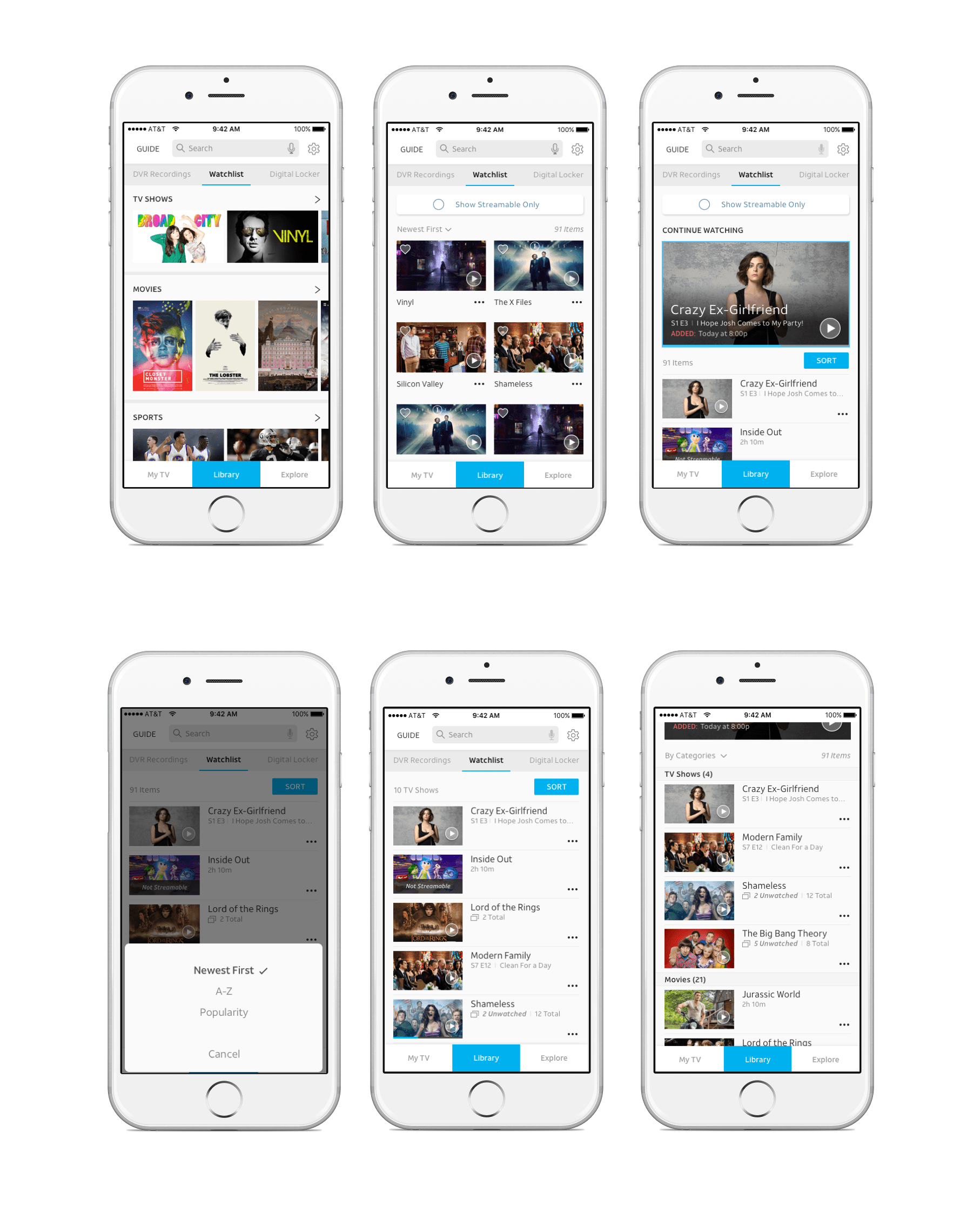
Watchlist Redesign
Problem
The former DIRECTV ‘Categories’ section did not utilize the most efficient method to maximize consumer usability and didn’t enable them to quickly browse through the large volume of available selections. Upgrading the section to reduce consumer frustration by increasing usability became a priority while also ensuring the design was consistent with new mockups being produced by the DIRECTV team.
My role
To achieve our main objective, I audited the previous user experience and made numerous design proposals for an optimal experience. These proposals were created by conducting exercises for content strategy, user journey mapping workshops, and more in conjunction with the DIRECTV design team. conducted the user experience, information architecture, content strategy and user research aspects.
What did we learn
Using a progressive disclosure approach and developing wireframes led to a more fluid path that DIRECTV’s audience could follow with ease. This in turn helped with the decision in picking a TV show or movie to watch and decrease the cognitive load that occurs from being overwhelmed with many choices.


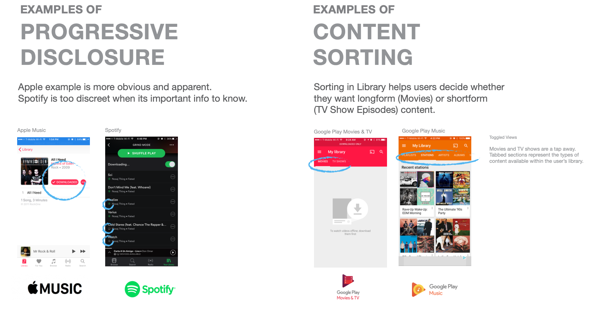
Comparative analysis
‘


