Karma Automotive
HMI Redesign
Problem
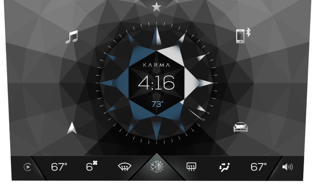
The main problem with Karma infotainment display was the complete lack of driver personalization, long start times, irregular design, incomplete features and a screen that was difficult to use, ultimately harming the user experience. I then had the opportunity to resolve these problems and give Karma a more modern, user-friendly design that is usable.
My Role
- I conducted usability test sessions with customers and facilitated internal dog-fooding workshops to validate concepts and designs early and often before handing off to engineering teams.
- I benchmarked additional electric vehicles for best practices on the HMI provided readouts on the competitive analysis studies created to internal stakeholders.
- Created and maintained the design system for the overall systems which includes the cluster and touchscreen designs.
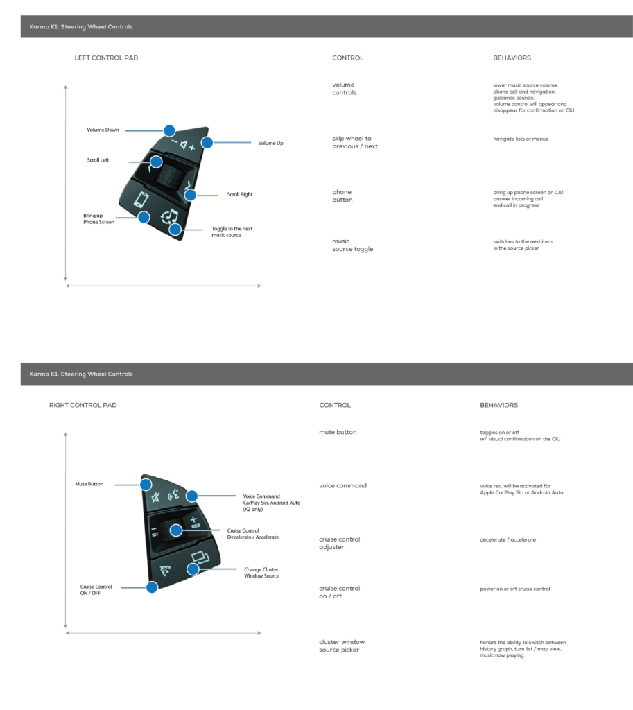
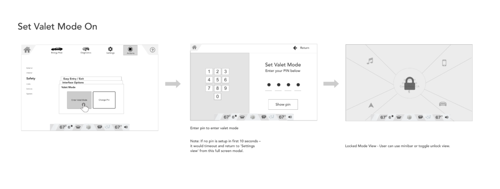
- I ran multiple design sprints for the creation of wireframes and visual design assets. This included providing the detailed workflows for features to be used in both the cluster and touchscreen designs.
What we learned
Drivers have limited attention spans. Embedded screens and displays are supposed to compliment the driver not demand all of their attention. Shortening the learning curve whether you were a frequent driver of the Karma Revero or brand new to the vehicle was always a top priority. In redesigning the HMI display, I also added new processes to accelerate the software development production, provide quicker consensus to feature rollouts by having use cases and prototypes for features to help us all work more efficiently and operate more agile.
Deliverables:
- Heuristic Evaluation & Comparative Analysis
- Design System Creation
- Clickable prototypes for several workflows
- User Testing plan and research study readouts with internal stakeholders

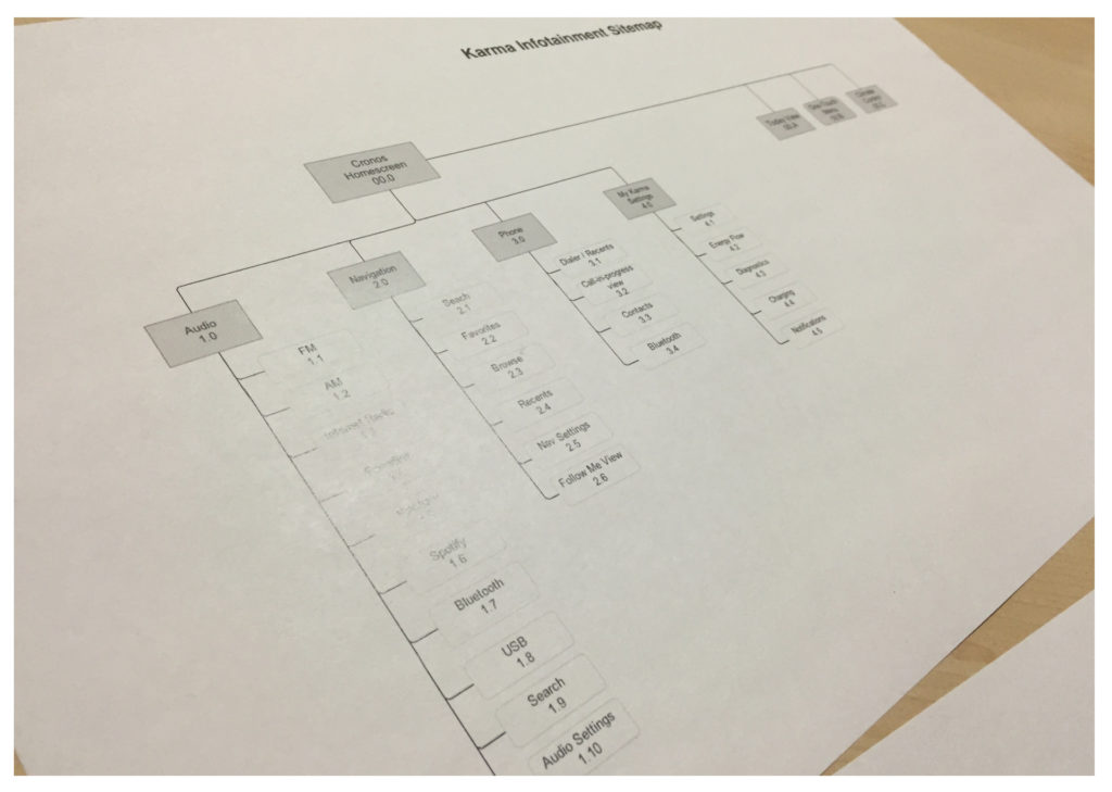
System Taxonomy


Infotainment Touch Screen & Climate Control Panel


